Preprocessing
Time-Frequency
This is the first processing step. You need to compute the time-frequency (TF) map for each of the raw SEEG time series using the complex Morlet wavelet transform [1]. You can follow the steps as indicated by the number as shown below:
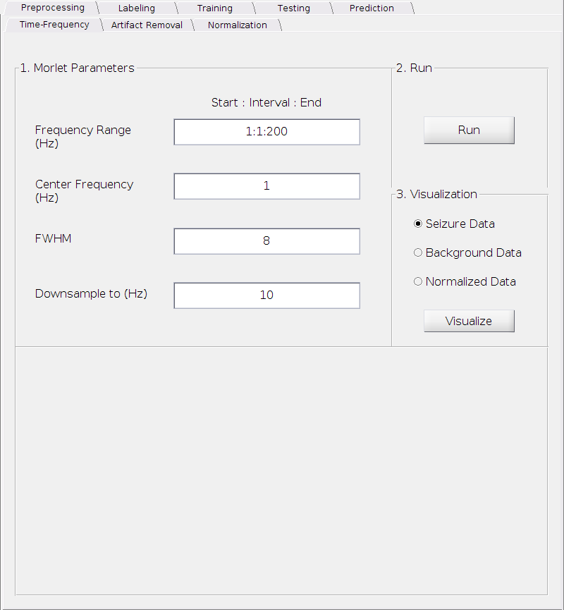
Set the parameters
Frequency Range (Hz):
This is the frequency range over which the wavelet is computed in a format of x:y:z Hz, where x is the starting frequency, y is the interval and z is the ending frequency (It’s a standard MATLAB notation). For example, 2:2:10 represents 5 frequency bins (2, 4, 6, 8, 10) Hz in total.
Requirements: All positive real numbers; x <= z and y <= z
Default: 1:1:200 Hz.
Center Frequency (Hz):
The center frequency of the exponential kernel in Hz.
Requirement: A positive real number.
Default: 1 Hz.
Full-width-half-maximum (FWHM):
The FWHM of the Gaussian window.
Requirement: A positive real number.
Default: 8.
Downsample to (Hz):
This is the frequency of the signal we will downsample to after computing the wavelet transform. The downsampling is necessary for both computational tractibility and storage saving due to the high sampling rate in the raw SEEG data. Setting this to a higher value would not significantly impact the results. However, information may be lost if this is set too low. We strongly recommend to keep it at the default value.
Requirement: A positive real number.
Default: 10 Hz.
Compute the complex Morlet wavelet transform
- Simply click the
Runbutton
- Simply click the
Visualization
Select one of the three options
Seizure Data: Visualize the TF plot of the seizure onset data.
Background Data: Visualize the TF plot of the background data.
Normalized Data: Visualize the seizure onset data after normalization against the background data. See the supplementary materials of our paper available from [2] for normalization procedure. However, this normalized version is only for visualization purpose and will not be used in later steps as we need to remove possible artifacts in both seizure onset data and background data separately before the actual normalization.
Click
Visualizeto see the TF plot.
TF Plot and Its Functionalities
The figure below shows an example of a typical TF plot. A brief introduction to the TF plot is described below, followed by the list of some main functionalities you may use to better visualize the data. Some additional functionalities are only available in some specific sections in later steps of the processing and will be introduced later when needed.
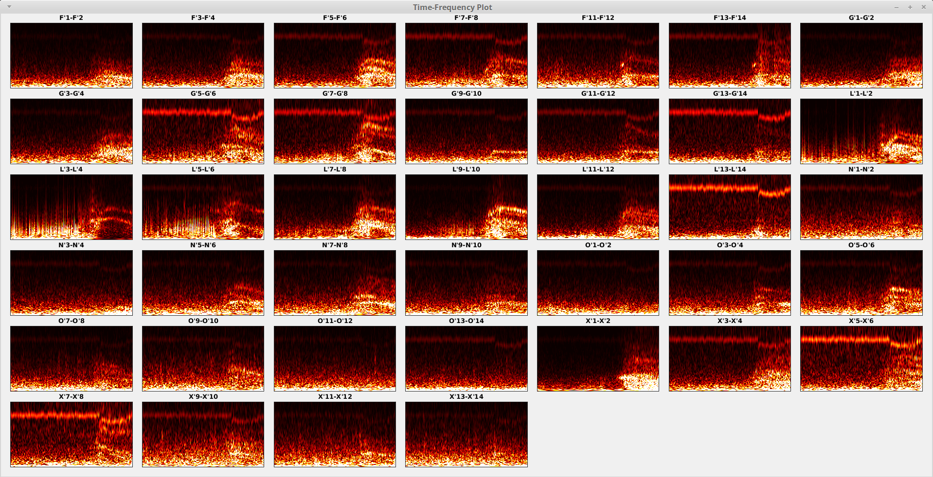
Each sub-plot (block) shows the TF map for a specific contact (channel), where the x-axis (horizontal) represents the time with left-to-right corresponding to past-to-future and the y-axis (vertical) represents the frequency with bottom-to-top corresponding to low-to-high. The time range depends on how you prepared your data segment in Brainstorm before importing into EZF workspace, while the frequency range depends on your “Frequency Range (Hz)” parameter set above. The contact names are shown on top of each TF map for each contact.
Some main functionalities are provided for a potential better visualization depending on your data and your focus/purpose. You may change the clip mode to pay attention to either lower or higher value range; you may export the current figure to hard drive in your favorite format and resolution. All options are provided as keyboard shortcuts to maximize the productivity.
Change the clip mode:
a- auto (default)You look at the center part of the histogram of each contact separately. This is useful when looking for patterns for each contact.
g- globalYou look at the center part of the histogram of all contacts. Then each contact is scaled correspondingly. This is useful when looking at the relationship between contacts.
h- high rangeYou look at the top part of the histogram of each contact separately. This is useful when looking for details of the bright parts.
l- low rangeYou look at the bottom part of the histogram of each contact separately. This is useful when looking for details of the dark parts.
H- super High range (not available in Preference)You look at the very top part of the histogram of each contact separately. This is useful when looking for details of the super bright parts.
L- super Low range (not available in Preference)You look at the very bottom part of the histogram of each contact separately. This is useful when looking for details of the super dark parts.
o- offTurn off the clipping and visualize the full range of the TF map for each contact.
You can setup the default behaviour in the Preferences, except for the super high and super low options.
Export figure:
e- export figure to disk.You can set your favourite format and resolution in the Preferences.
Quick closing the window:
x- close the figureInstead moving your mouse to the corner and left click the “x”, you may simply press “x” to close the figure.
Above shows the options you have to visualize the TF maps for all contacts. If you want to visualize a single TF map, just left-click that map using your mouse. Then you will see a figure like (e.g. we show the TF plot for contact L’3-L’4 here):
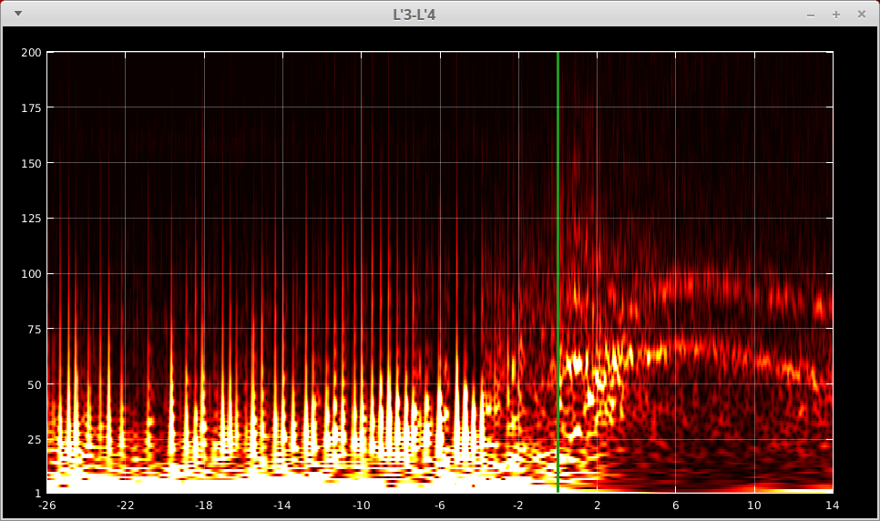
Now the x-axis (time) and the y-axis (frequency) are labeled explicitly. And the green vertical line indicates the zero time point. A few more functionalities are:
Change the grid options:
g- toggle the grid on and offuparrow- decrease the grid density on y axisdownarrow- increase the grid density on y axisleftarrow- increase the grid density on x axisrightarrow- decrease the grid density on x axis
Full screen mode:
f- toggle between full screen and the original size
Quick closing the window:
x- close the figure
A tick in the “TF” column will show up in the Data panel for each of the seizures of your selection, indicating the completion of this step.
Artifact Removal
You may already noticed that the TF maps above were heavily contaminated by some artifacts. And those artifacts are visible across almost all contacts. See the example from one of the contacts below.
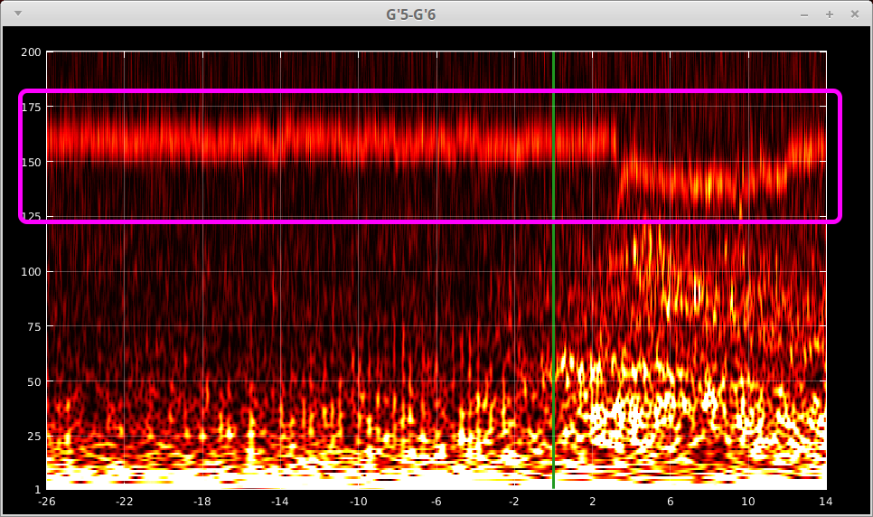
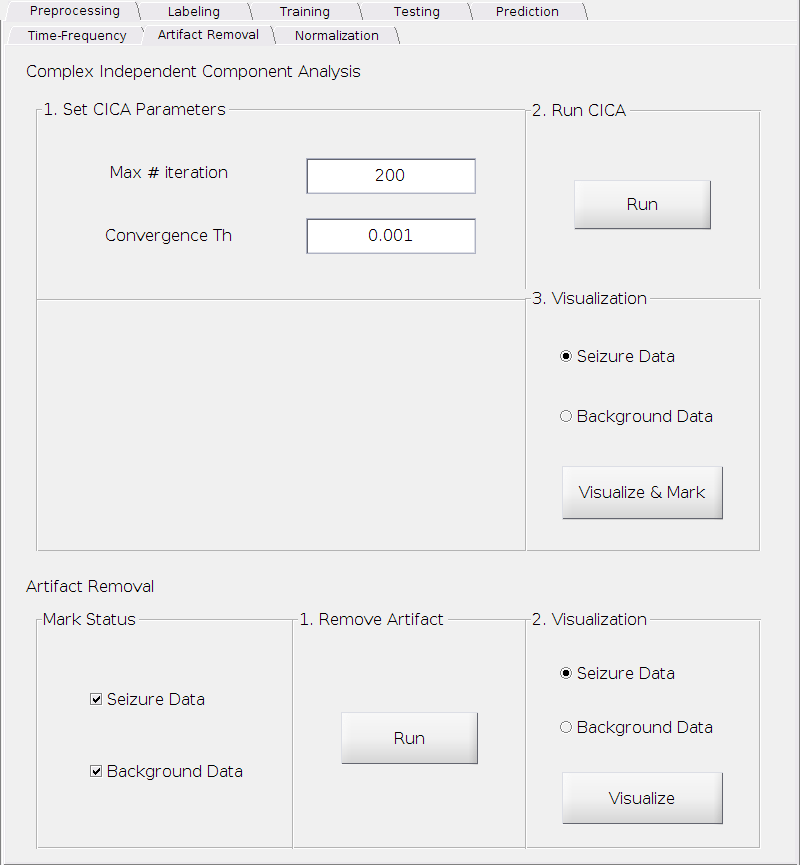
We need to remove it before any further processing or analysis. The artifact removal can be successfully achieved by complex Independent Component Analysis (cICA)[3]. The cICA and artifact removal tab is shown below.
Perform cICA
Set the parameters
Max # iteration:
The maximum number of iterations.
Requirement: A positive integer.
Default: 200.
Convergence Th:
The threshold for determining convergence.
Requirement: A small positive real number.
Default: 0.001.
Compute cICA
- Simply click the
Runbutton
- Simply click the
Visualize and mark
In this step, you need to visualize the extracted independent components, identify the artifact component(s) and mark it/them in order to remove it/them in the next step. You have to do this for the seizure onset data and the background data separately. We will use the seizure onset data as an example.
Check the radio button
Seizure Data.Click
Visualize & Markbutton.
You will see a TF plot similar to the following one.
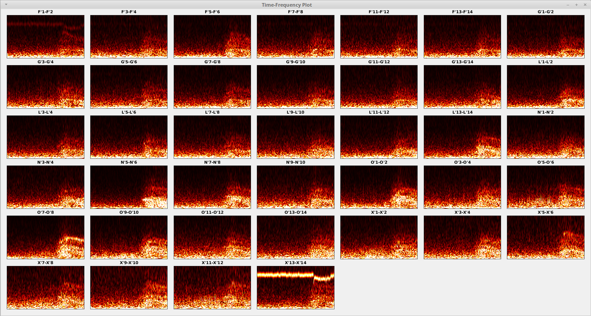
Notice that the artifact is separated from the “normal” contacts and only the first one and the last one contain the artifact we are looking for. Now
right-clickthe first and the last contacts to mark it using your mouse. After marking, they will become semi-transparent.Press
skey on your keyboard to save your marking.
If you need to modify your selection, simply
right-clickthe contacts again to un-mark. Once you are satisfied with your selection. Pressskey again to confirm the changes. A prompt window will show up if the marking existed before. ClickYesto overwrite the old one. Now you can close the figure and a tick will appear in front of the “Seizure Data” inside the “Mark Status” panel in the “Artifact Removel” section, indicating that the marks for seizure onset data exists.If you want clear your selection and restart from the beginning, press
ckey.You need to repeat the steps above for the background data again.
Note that picking the artifact components is somehow subjective. Artifacts may sometimes looks like fast activities or may appear with fast acitivities in the same component. Therefore, be careful with which one to pick and which one not to. We recommend select artifact component(s) in a non-aggressive way so that you do not remove actual fast activities in the seizure onset data. You may be a slightly aggressive when picking the counterparts in the background data however.
A tick in the “IC” column will show up in the Data panel for each of the seizures of your selection, indicating the completion of this step.
Remove artifact(s)
Check if both marks for seizure onset data and background data exists in the “Mark Status” panel.
If yes, click
Runto remove artifact(s).Check the result after artifact removal by selecting one of the two data and clicking
Visualize.
You may see the cleaned TF plots as follows for the seizure onset data for example.

You may go back and re-mark the artifact component(s), then re-run the removal procedure until you are satisfied with the result.
A tick in the “AR” column will show up in the Data panel for each of the seizures of your selection, indicating the completion of this step.
Normalization
After removing the artifact(s), now we can normalize the seizure onset data against the background data in order to emphasize the changes from the pre-ictal period to the ictal period as well as emphasize the higher frequencies effectively.
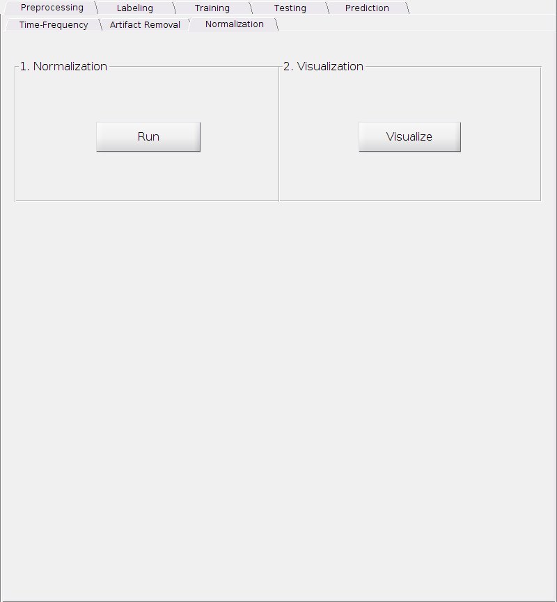
Nothing complicated here. Simply
Click
Runto perform the normalization.Then click
Visualizeto check the result.
A tick in the “N” column will show up in the Data panel for each of the seizures of your selection, indicating the completion of this step.
Reference
[1] A real-time Gabor primal sketch for visual attention. Also see Wikipedia “Morlet wavelet”.
[2] A fingerprint of the epileptogenic zone in human epilepsies, Brain, vol. 141, no. 1, pp. 117-131, 2017.
[3] Independent component approach to the analysis of EEG and MEG recordings, IEEE Trans. Biomed. Eng. vol. 47, no. 5, pp. 589-593, 2000.